Saturday, May 14, 2016

End of Semster

Once again it is time to reminisce about what I have accomplished this semester and show off my last projects. I'm especially proud of this semester's turn out, partly because they look really good (narcissistic pat on the back) and partly because they were all done with techniques and tools I have never used before. 

This was the semester I taught myself some Photoshop skills, and though I have much more to learn, I am feeling pretty good about certain aspects of it. 

It is also my last semester printmaking. I have never fallen in love with an art form as I did with printmaking. As I finished my last print and packed up my stuff I felt so sad to leave the printmaking room. So many late nights were spent there, listening to NPR's This American Life, thinking about what it means to be human as I worked. There was something so peaceful and entrancing about the repetitive motions: ink, alighn paper, rotate press, repeat. I can't help but sing Vitamin C's "Graduation (Friends Forever)" to myself, it seems appropriate.

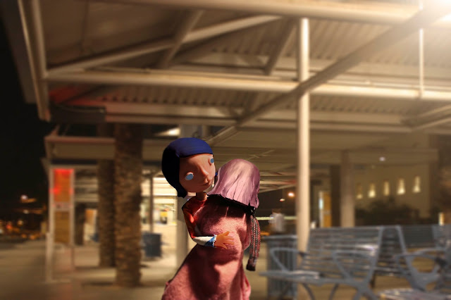
So here are the pictures I created using the Super Sculpey dolls I made. It's called "Alone Together" a story about Glenda, an anthropomorphic representation of the kind of loneliness you experience when you're surrounded by people (a solely negative feeling), and Soledad, the kind of loneliness you experience when no one is around (a feeling that can be either positive or negative). This is the story of how they met, so that they may be alone together. 


I have already posted the last painting I did for my digital painting class, but here it is again for the sake of categorization. 


Lastly (well not lastly I have a print I need to photograph nicely, and I'll post that as soon as I borrow a camera), here is my last typography project. I have actually learned how appreciate typography and design more than I thought I would because of this class, and my wonderful teacher who nearly cried and insisted on taking a group picture after our final exam. 


Bye for now. 

Wednesday, April 27, 2016

Where did the time go?

Quick post today, just wanted to share some of the art projects I've been working on. Lately it feels like time is both rushing by way too fast while simultaneously nothing happens. It's that time of the year: finals. 

Here is a digital painting I just finished and printed today. Look familiar? It is basically a scene from "Up," from the beginning montage of Carl and Ellie's life. I really love that montage, so much was said and felt in just a few short minutes. So I took that scene, kept the basic color palette and composition, but added in my own figures and did it in my own style. 

I wanted to keep that lovely nostalgia that's conveyed in these scenes. I originally wanted to modernize it, give them a smart watch and an iPhone, but then I decided that this scene was more about the nostalgia of the "good ol' days" and just chose another nostalgic era and made the characters a little younger. 

BTW the man is basically James Dean.   


Next I'd like to share a project that has basically consumed my life lately. The final product will be illustrations telling a story of a girl who moves to a new city, focusing on imagery and feelings of loneliness, especially loneliness within a crowd. Who here hasn't experienced that right? It's a special sort of loneliness, not the kind where you take a long drive by yourself, or the kind where you stay late to work while everyone else left, but instead the kind of loneliness where the more people are present, the lonelier you feel. 

To achieve this, I decided that I was not going to draw or paint anything. So photography was the logical choice. I created a couple of dolls to be my protagonists and I will be photoshoping them into pictures I take around town. 

Here are my models, each made of an aluminium wire skeleton, plumped up with aluminum foil, and given life with super scupley  and tiny clothes I sewed for them. 

These are pictures from the photo shoot I had with them. 

Yes, I sewed all those tiny dresses. And the tiny scarf.


She has tiny shoes, with laces, grommets and all. 


 Sitting on a sculpey box, it's basically play-doh for grown ups. She'll be on a bench later.


. Does that metal pill bottle look familiar? I was the trophy I made last semester. 


Talk again soon!


Sunday, April 10, 2016

Birds, bugs, and Italian food (?)

Happy Sunday!

I hope it's been a nice relaxing weekend, I know for me it hasn't been. It never is. I have been painting all day today and yesterday and I deserve a prize for the world's slowest painter! It took me like 8 hours to paint a couple of very simple buildings! But that's a work to share next week. I would like to first share some finished work. 

Here is another bug print. The finished bombardier beetle I talked about in my last post. "The one with the exploding butt?" you ask--yeah, that one. 

This is showing the 3 color "printing" I did, always starting with the lightest color and ending with the darkest. It's a very delicate print, I felt like a surgeon doing some of those tiny cuts for its antennae and face. I'm pretty dang proud of this one if I do say so myself. 


So here is the project I have been teasing about for several weeks, the bird book. To recap, this is a book I made, illustrating the poem "13 Ways of Looking at a Blackbird" by Wallace Stevens. Here are some of the page spreads. I will talk about them one by one. 

This is the title page. The poem itself is very dark, and mysterious, so I tried to convey that in this page. I didn't want it to read as "this is a scary story," but more like "this is something strange and mysterious."


This is the first page, where I illustrate the bird and the snowy mountains together as one. Where the bird belongs to the mountains as the mountains belong to it. 
 These are pages 4/5. Page 4 describes a man, a woman, and a bird being one. At first the black areas on the bird look like its wings or part of its coloring, but then you see they are actually the silhouettes of a man and a woman. Page 5 is the bird whistling, where the lungs not only represent its voice and breath, but also the bird's power. 
 These are pages 6/7. The 6th page is my favorite, the bird shows us an icicle-filled window. It looks so lonely on that small branch, the way one feels while looking out into the dead of winter. Page 7 is the golden bird, you can't see it here, but once it was printed out I colored it in gold ink. 

These are the last 2 pages. Page 12 is once again the bird and its environment being one, being complementary.  Ultimately this poem is about life and death, which is why the last bird is dead, since "it was evening all afternoon." Evening is dark, like the bird, like the fear of dying and like the bad things that happen as part of life. 

I'm not entirely sure what this poem is about. But to me it's about the "blackbird" being metaphorical darkness, and how it's as natural and inevitable as icicles forming or rivers flowing. With life and nature comes disaster, sadness, and we can't escape it anymore than we can escape nature. It afflicts men and women alike, and through we may dream of better times, happier things, golden birds, there's not escaping the blackbird.  

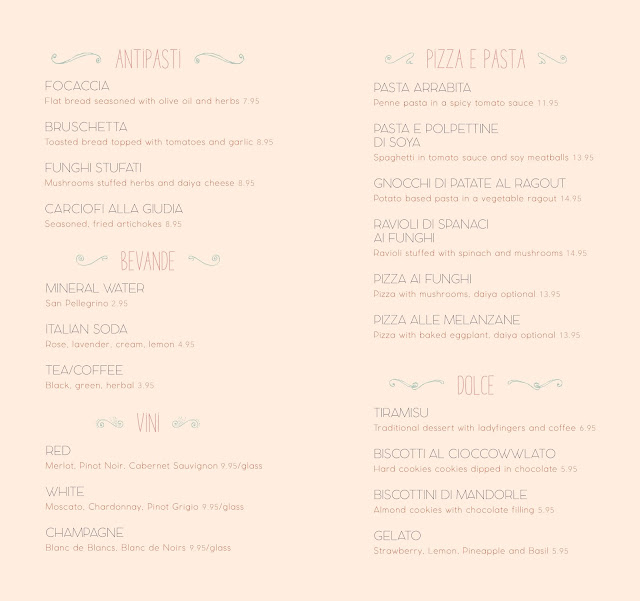
Before this post gets too depressing, let me tell you some food jokes! And by food jokes I mean really bad food descriptions I wrote for some menu designs I created. 

Do you ever read a fancy menu and it uses phrases like "cool bed of lettuce" or "crisp, juicy apple slices," "gently smoked" or even "rich, handsome potatoes"? OK, I made the last one up, but sometimes food descriptions are really weird, like they're trying to get you to make out with the food instead of eating it. Or sometimes they're not helpful at all, like "lentils in choice spices," I have no idea what this is going to taste like! So I took advantage of a menu design project to have some of my own food item descriptions. 

I should also mention that these are menus for a fake vegan, Italian restaurant I made up called "Bel Niente." It means "Beautiful Nothing." I guess I'm poking fun at the fact that people seem to dig foreign sounding things just because they're foreign, even if it's bad, or completely ridiculous. 

Enjoy. 


(I know you can't read this one, but appreciate the design?) 


Until next week!

Monday, March 28, 2016

The Birds and the Beetles

Happy Monday everyone!

It's time to get back to a blogging schedule. I'll try my best to do a post on Sunday, but if not then, Monday's the day! 

So I have been working on these entomology prints after contacting some amazingly friendly entomologists (insect scientists) here on campus. Here is one of the best prints to come out of the first set. The insects depicted are called whiteflies, though they are not flies at all. They are tiny, really tiny, yet incredibly difficult to get rid of and a huge nuisance to farmers. Even though they are annoying, and potentially threatening to our food supply, I find them to be quite beautiful. Their delicate, pale yellow bodies, and their gossamer wings show more beauty than destruction, more fragility than robustness. The picture really doesn't do it justice, as I have used very transparent ink to create this print. 


The next print I will be doing is about the bombardier beetle, a local species to southern Arizona. These little guys are amazing! In short, they use specialized organs in their behinds to spray a boiling-hot, ghastly smelling spray. They do this to defend themselves of course, since they are small and vulnerable. They are about the size of an uncooked grain of barley, but this spray is massive, and accompanied by a loud "pop" sound.

Here's a picture of one in action.


I don't have much experience with insects unfortunately' so trying to do a close up that does one of these creatures justice is very challenging. In order to get a better understanding of them, I decided to sculpt one. 


This is not amazing by any standards, and it was somewhat hastily produced out of bent paperclips and some very old sculpy (basically grown-up play-doh). This was not just fun, but it got me thinking about how we learn. A lot of us enjoy seeing pictures and diagrams to help us understand, other enjoy learning through auditory information--podcasts, lectures and such--but how often do we learn by creating? This is different than learning by doing, the way one might learn to change a tire, or knit. Learning by creating, is where you teach yourself, and that's a lot of art. We teach ourselves how to draw, paint, sculpt, even though our teachers might give us some tips on how to hold a brush, or how to use a tool to get a desired effect; this is art school. 

But do we implement that outside of art school? Of course I wouldn't recommend trying to fix a car or build a bridge without prior knowledge, one could really hurt oneself. Yet I wondered, how can learning by creating exist outside art school. Cooking comes to mind, we have thousands of great recipes from all over the world, but someone had to come up with them, and there surely were a lot of failures along the way. A lot of science works this way, the first people to figure out how to build telescopes had to create without any prior knowledge, and that's amazing. Anyhow, I digress, but I think this is something to think about. 

Back to art shall we?

Here are some pictures of a cute little accordion book I made today, it's a little rough, but I think it will be a lot of fun to fill. I'm not sure with what just yet, but some sort of mathematical calculations. 

Gotcha! It's going to be drawings of course! 


Before this post gets too long, I want to share some of the illustrations I have been doing for the poem "13 Ways of Looking at a Blackbird" by Wallace Stevens. I will do a post more about this when it is fished. Basically there are 13 stanzas, and an accompanying illustration for each, as well as a cover page. And these will all be put together in an accordion book! I think this is going to be one of my best projects so far. 


Until next week! 


Thursday, March 17, 2016

Spring Break Post

I hear today is also St. Patrick's Day, if I'm wearing one blue sock and one yellow sock is that close enough to green? No? Okay . . .

It has been a pretty good spring break so far, I finished a couple of projects, started a couple of new ones, went camping for the first time, and hung out with my mom. Unfortunately it's already Thursday, Spring Break is never long enough! 

I'd like to share some drawings I did while camping, since I don't often share stuff I do outside of school. 

This one of is B. reading after a very long hike. 


This is J. by the fire pit, I thought she was in a very interesting position, so I had to capture it. 

I like to ask people to give me an animal and an occupation, and then I draw the results. A firefighting squirrel, and a fish that's a forest ranger.


This is from a page of ideas for an upcoming illustration project, where we illustrate a poem titled "13 Ways of Looking at a Blackbird." More on that later. 


This is my final poster design for "Design Culture Now." I'm pretty proud of it, it's so simple, yet eye-catching. 


Lastly, as promised, I have my final illustrations for that crazy long project I did two weekends ago. 

Again, this is a pretend article about a vegan restaurant in town, Lovin' Spoonfuls. I took some pictures of the place, the owner, and the amazing food, and recreated it with my new-found Photoshop skills. Every drawing was first done in pencil, and colored in Photoshop, a process far more arduous than I expected. But it was worth it. 

These two pages were also hung up in a display case in a hallway in the art building. All over the hallways there are various display cases were teachers put up their student's best work for a few weeks at a time. Not to brag (but yes to brag), both of my spreads got displayed, while most people only had one page up. Win.


Instead of the usual filler text, lorem ipsum, I created content with Yelp.com reviews of the restaurant. Which was very handy, because I could completely control the length of each paragraph and column, and make them fit in with my spot illustrations (that's the drawings of food). In the real world, with a real article, this would be much harder to achieve.  

That's it for now, talk again soon! 

Tuesday, March 8, 2016

Almost Spring Break!

Happy Tuesday!

Yes, I have fallen behind on my blogging, and yes, it's because I've been busy (like that's news!). But this weekend was particularly crazy, I had a project due on Monday that I thought I could finish by Saturday afternoon, so I went out with friends, planned to go hiking, took lot's of breaks. And then one of those "you know you're in college when" movements happens, the live-in-the-library, eat-from-the-vending-machine, no-time for-showers sort of moments. There was some crying and screaming, some thoughts of dropping out of school to become a beach bum, but in the end I got the project done. And even though it's not my best work, I'm pretty proud of it. I taught myself how to use Photoshop and I learned a lot. I never want to go through that again, so I'm trying to pick my battles more carefully for the rest of the semester. 

I will upload nice picture of those soon! I have InDesign CS4 at home, and at school we us CC, and they're not compatible because Adobe likes to be complicated (?). So I'll have to turn my InDesign files into normal photos--JPG and such--at school. 

In the mean time let's look at what I've been doing in the past couple of weeks. Here are some prototype posters I'm making in a typography class. I know I never mention this class, and that's because so far we have not done anything remotely interesting in it. 


Please click on the pictures so you can actually see them. This is a project is about creating a promotional poster for an art show that took place decades ago and for some reason this has turned int a typography/graphic design project for art students everywhere. Art school, go figure! 

Here is the final final portrait I did in the style of Gabrielle Munter, an expressionist painter. I'm very happy with it, the colors are really fun!


And here is my final astronomy print. Unfortunately I had some trouble with it. Perhaps there were too many colors piled up on top of each other, perhaps I hurried while I was carving, perhaps I printed on wet ink, or perhaps I have somehow angered the printmaking gods. The last color I printed, dark blue, did not completely cover up the yellows and red I had printed first, thus, giving outer space a green tinge on one side and a purple blog on the other. Outer space is not green! I was so sure it would be OK, but alas, I was wrong. All I can do now is move on--and maybe scan it and try to fix it with my new Photoshop skills. . .


That's it for now, promise I'll be back soon! 


Sunday, February 21, 2016

Stuff is gettin' real

Happy Sunday!

Things are in full swing now, and I'm as busy as ever! I have been getting a lot of stuff done, I've been drawing a lot, painting, and printmaking (Not to mention other school and life stuff like reading books, doing chores and homework). It has been an exhausting semester and Spring Break cannot get here soon enough, I need a break.

But that's enough complaining, on to the art! Printmaking has been real slow going, but I just printed my first color! It's official, once you reach this phase it's basically smooth sailing from here. I'm getting this done by the end of the week gosh darn it! I need to finish it in order to send it to off to an art contest too, and the deadline is getting close.

One print is done on official BFK paper, and the darker one is done butcher paper, which I use for test prints. 


For painting I have my first major assignment to complete, which is a portrait done in the same color palette as a master artist. It doesn't have to be in the style of said artist, but the spirit of the color palette should be conveyed. 

For my master artist I chose Gabriele Munter, a German expressionist painter who worked in the early 1900's. You might have caught her Google Doodle back in February 19, 2014 for her 137th birthday. I chose her not only for her interesting and weird color palettes--which I enjoy because skin color is nearly impossible to paint--but also as a way to learn about a cool female artist at a time when women were still not really allowed to be much more than wives and mothers. 

I found out that her family actually supported her desire to become an artist and sent her to a women's art school. As her career took off she rubbed elbows with big names like Kandinsky and Matisse. She helped create an impressionist group, and was one of the very few women who really participated in the movement. We know big names in impressionism like van Gogh, Monet, and Toulouse-Lautrec, but forget the women who probably didn't even get to reach their full potential since they were not allowed in the big art schools. 

As a way to remember this amazing woman, I am honoring the color palette in this groovy portrait she did. I printed out this horrible picture that does not do the real thing justice and practiced the colors with a simple recreation.


But I'm also doing a real painting, which I just started today. My lovely friend A posed for me. 


I decided to sort of keep the background, but abstract it a little, and also painted my friend sideways, because it'll have a creepy feel to it that way--which is a very different feel from Munter's lovely landscapes, but I have to use her color palette, not her aesthetics. Also, art school: do whatever you want while you still can! 

Lastly, before this post gets too long I'd like to share a prototype for my next illustration project. It'll be a magazine spread for an article about a local vegan restaurant, and this is a cartoon I made of the owner there. Eventually I will have 2 full page spreads, one will be a 2 page illustration with the title of the article and an intro, and the other spread is the actual article with spot illustration. There will not be a real article, as that takes journalism skills I do not have, so it'll just be placeholder text--lorem ipsum or something--but it'll look like a real magazine article! 


The owner is this super nice older woman who just wants the world to enjoy vegan food.

Until next week!